

✚
Headway
inSight
—
roles
art direction
logo
brand suggestion
—
Headway inSight – a new LCSW therapy practice – establishing themselves with a message of hope, health, and healing, requiring an identity reflecting their centralized concept of community positive communication for individual and collective wellness.
CHALLENGES:
. establish a unique voice | peacock amongst pigeons
. adaptable identity | yellow letterhead-better (client's a Pearl Jam fan)
. brand strategy suggestion | lively up yourself
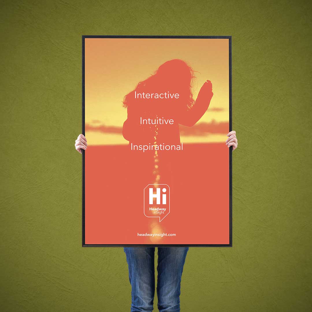
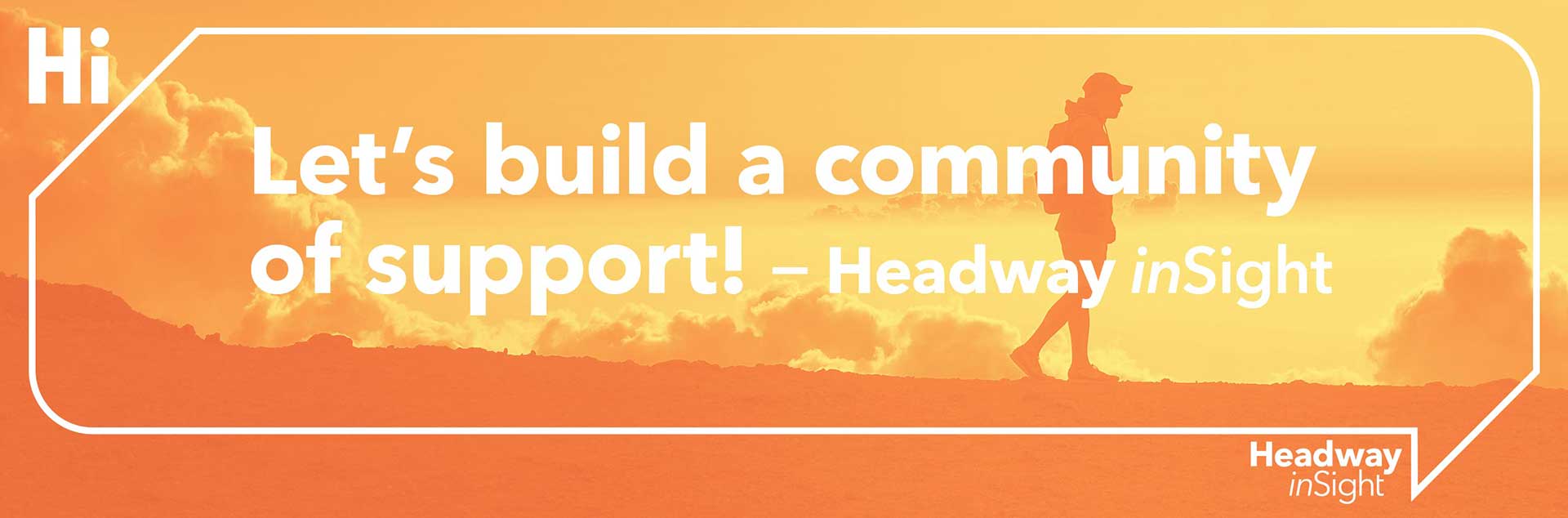
Leaning away from the repetitively regurgitated human forms found in most councilor/therapist identities, a cordial, communicative, and connective approach allows Headway inSight, with a word balloon establishing healthy dialog, to simply say, “Hi.”
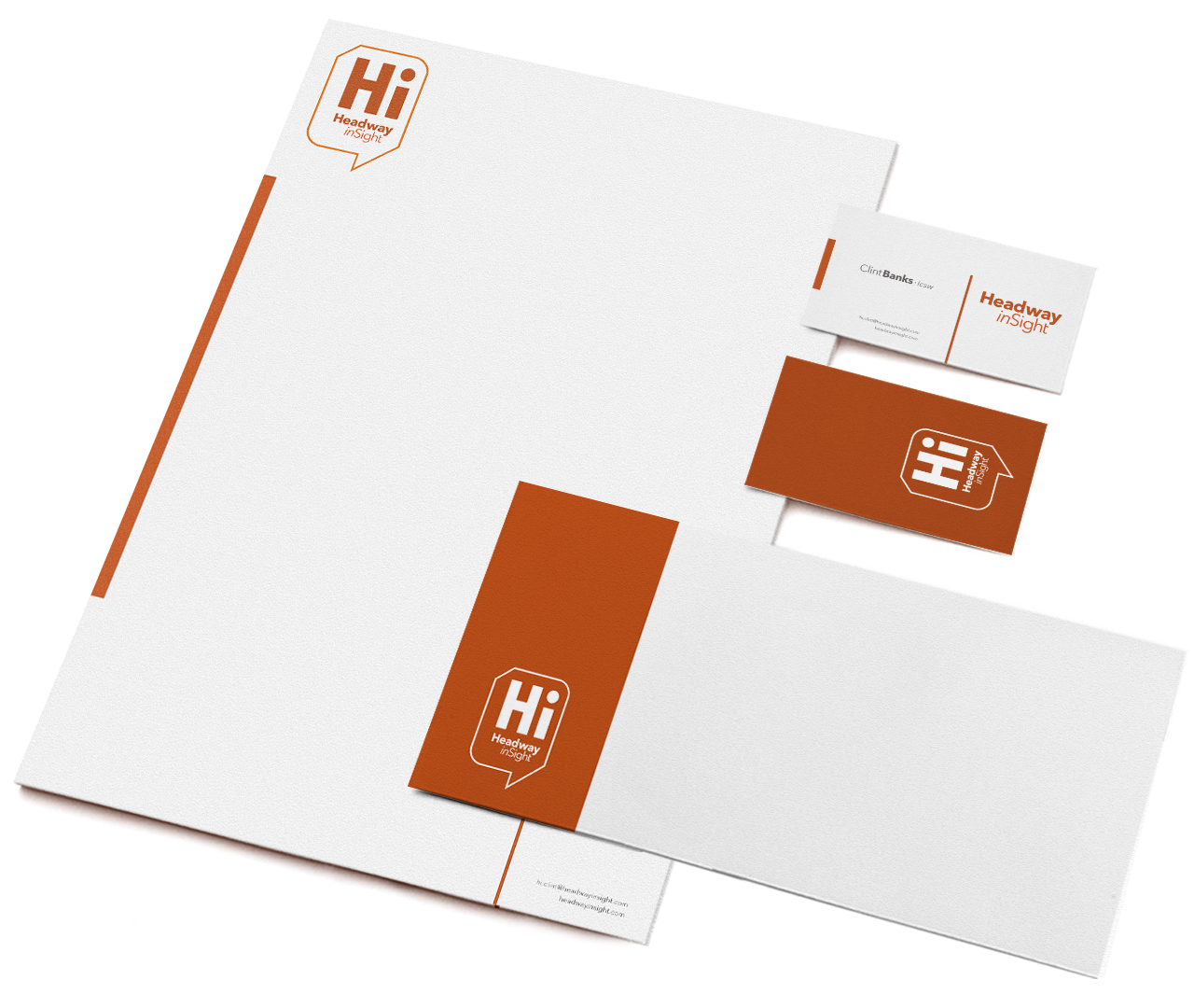
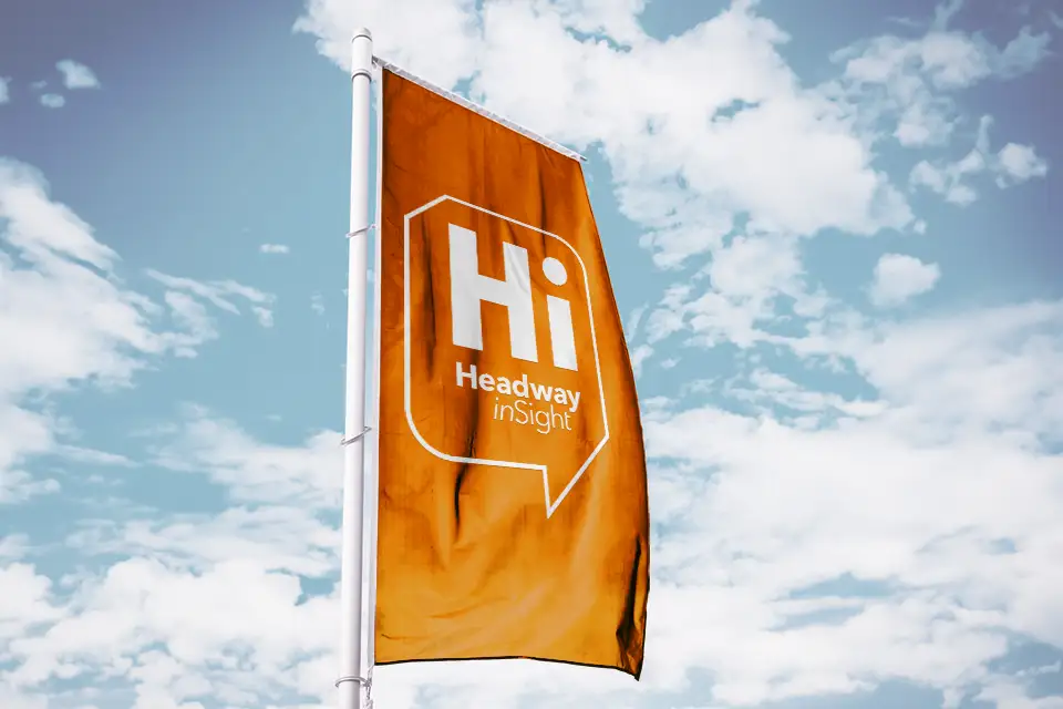
Adaptability and change allows for greater resourcefulness, and a logo can be just as resilient as people when structured appropriately. Offering greater usage, the modularity of the Headway inSight mark presents options for a variety of limited and unlimited spacial requirements without sacrificing integrity.
Meanwhile, with the warmth found in the autumnally earthy color palette and outdoorsy imagery reinforces a sense of grounding and exploration within introspectiveness, as well as communal relationships.
“We can’t solve problems by
using the same kind of thinking
we used when we created them.”
— albert einstien
r : 196 c : 18
g : 91 m : 76
b : 40 y : 100
#c45b28 k : 5
r : 233 c : 5
g : 123 m : 63
b : 38 y : 98
#7897c4 k : 0
r : 228 c : 5
g : 92 m : 78
b : 37 y : 100
#e45c25 k : 1


—
Thrilled with the outcome of his identity package and excited to implement it into every aspect of his prospective business, Headway inSight continues to promote his message of conversations for better health and forging communities of support. For more positive, heady goodness, please feel free to visit HeadwayinSight.com


✚ design ✚ illustrate ✚ create ✚ collaborate ✚
©SUITE76 · all rights reserved