✚
Sound
Ingenuity
—
roles
art direction
logo
web design
web dev
brand strategy suggestion
—
Wanting to expand clientele and gain greater market recognition in the Southern California low-voltage installer market, Sound Ingenuity required an update with upgraded appeal, better reflecting the quality of products and services they proudly stand behind.
CHALLENGES
. identity refresh | you spin me right round
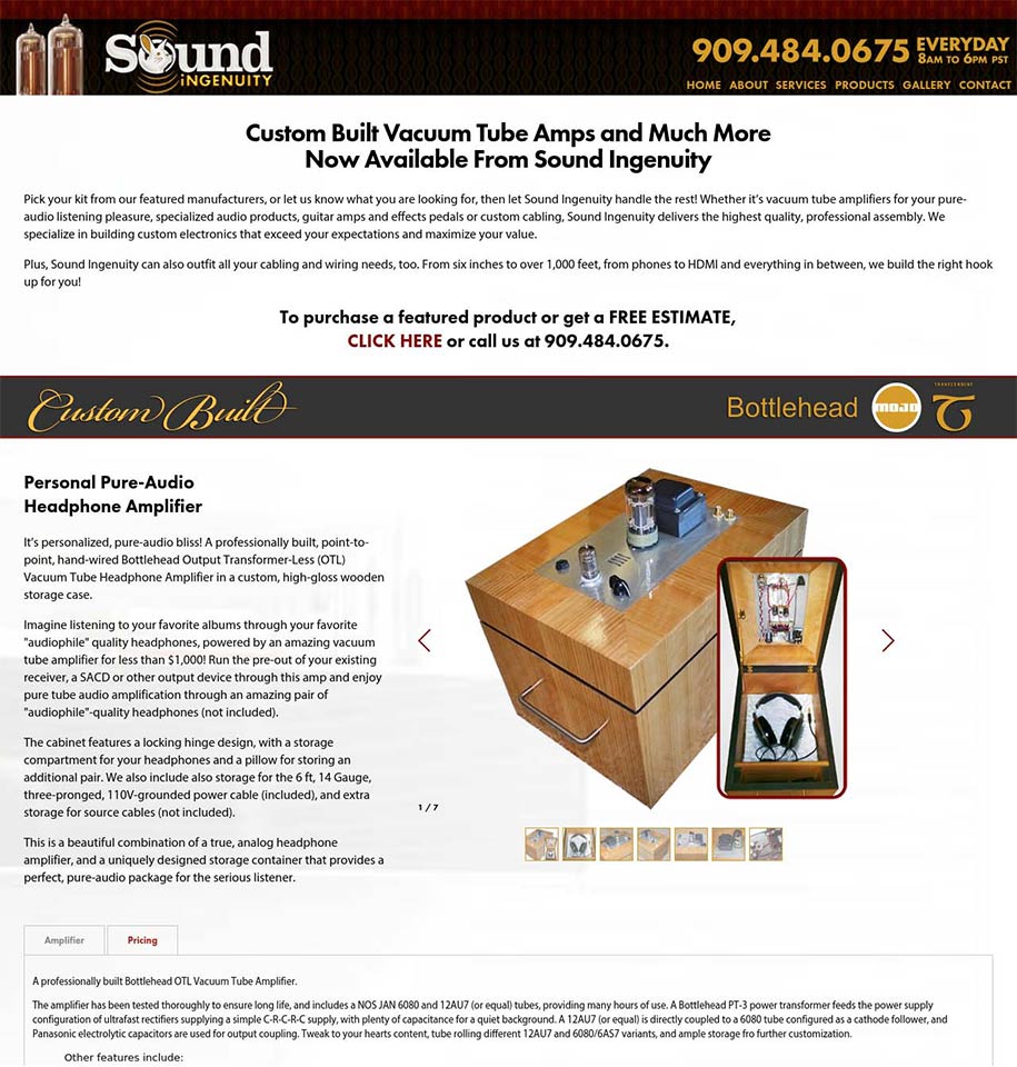
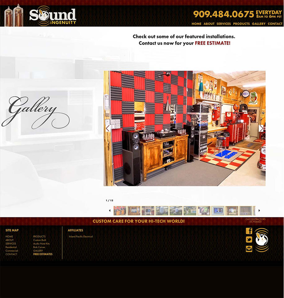
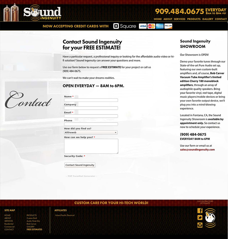
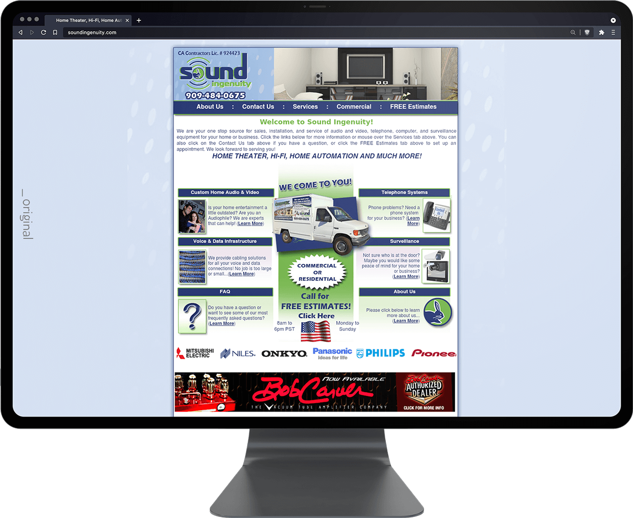
. website modernization | simpli-fi
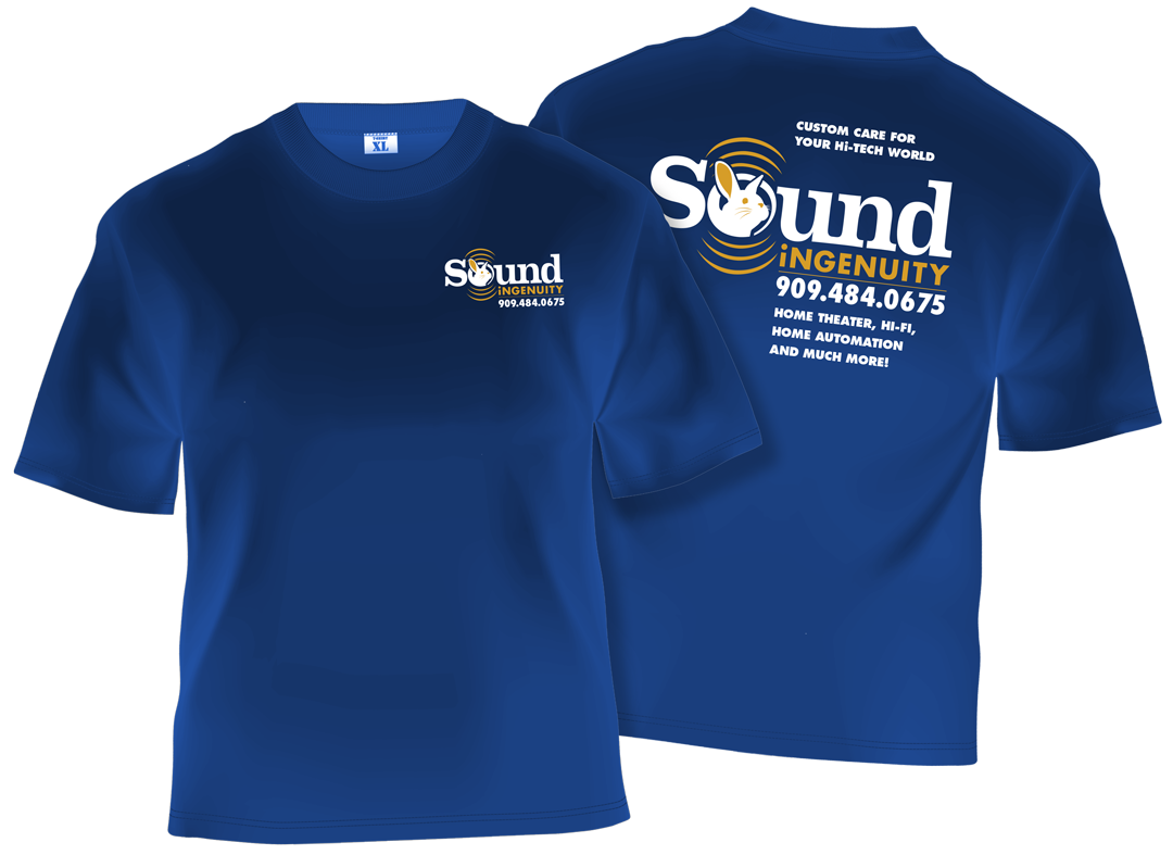
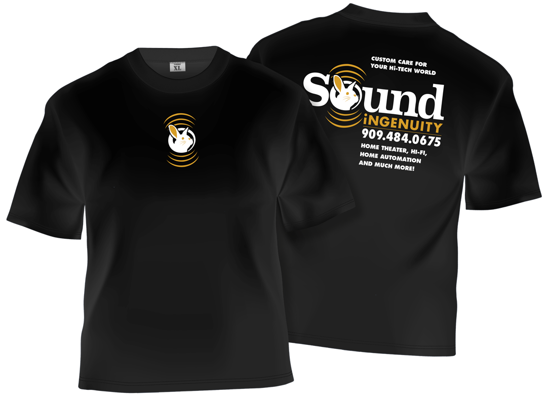
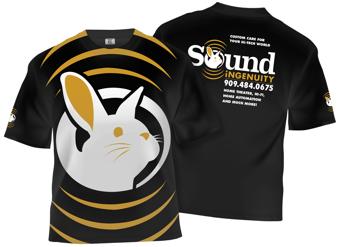
. professional apparel | fashion is danger
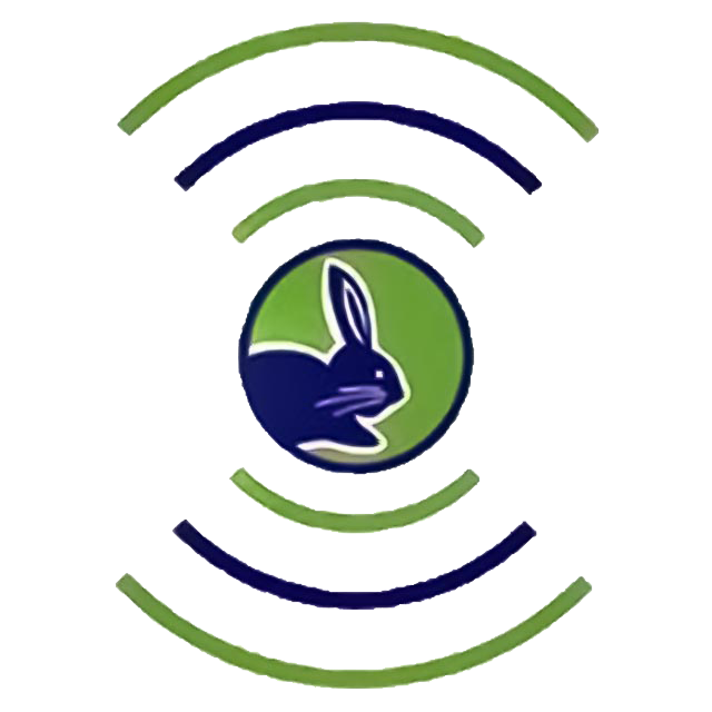
Clarity and readability are at the forefront of this redesign, moving away from the bulky, stylized, novelty typeface in favor of a streamlined and refined pairing – more reflective of the brands of products customers request for installation. Meanwhile, increasing the scale of hidden elements (ie.: the bunny) better revealing the novel messages previously overlooked.
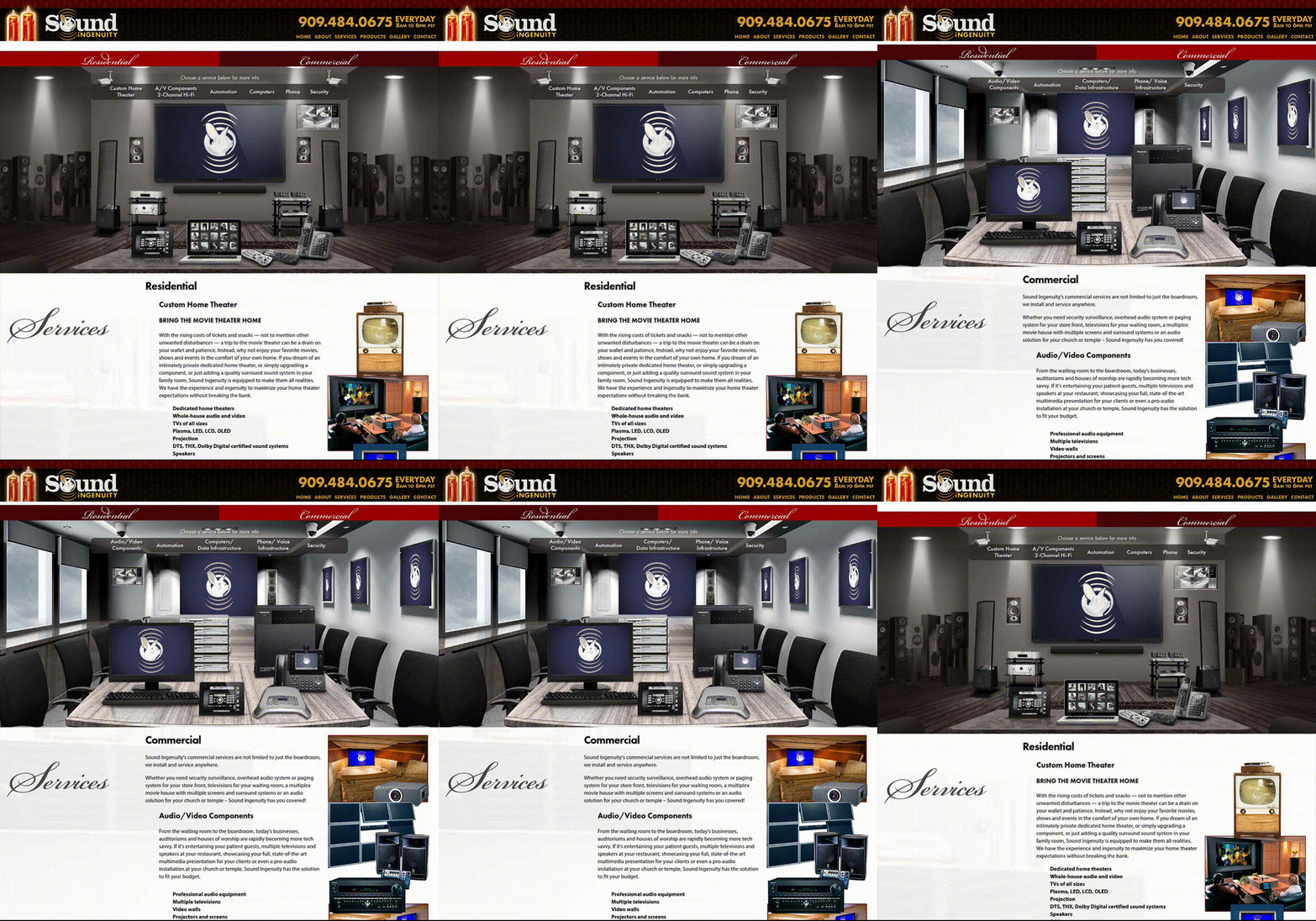
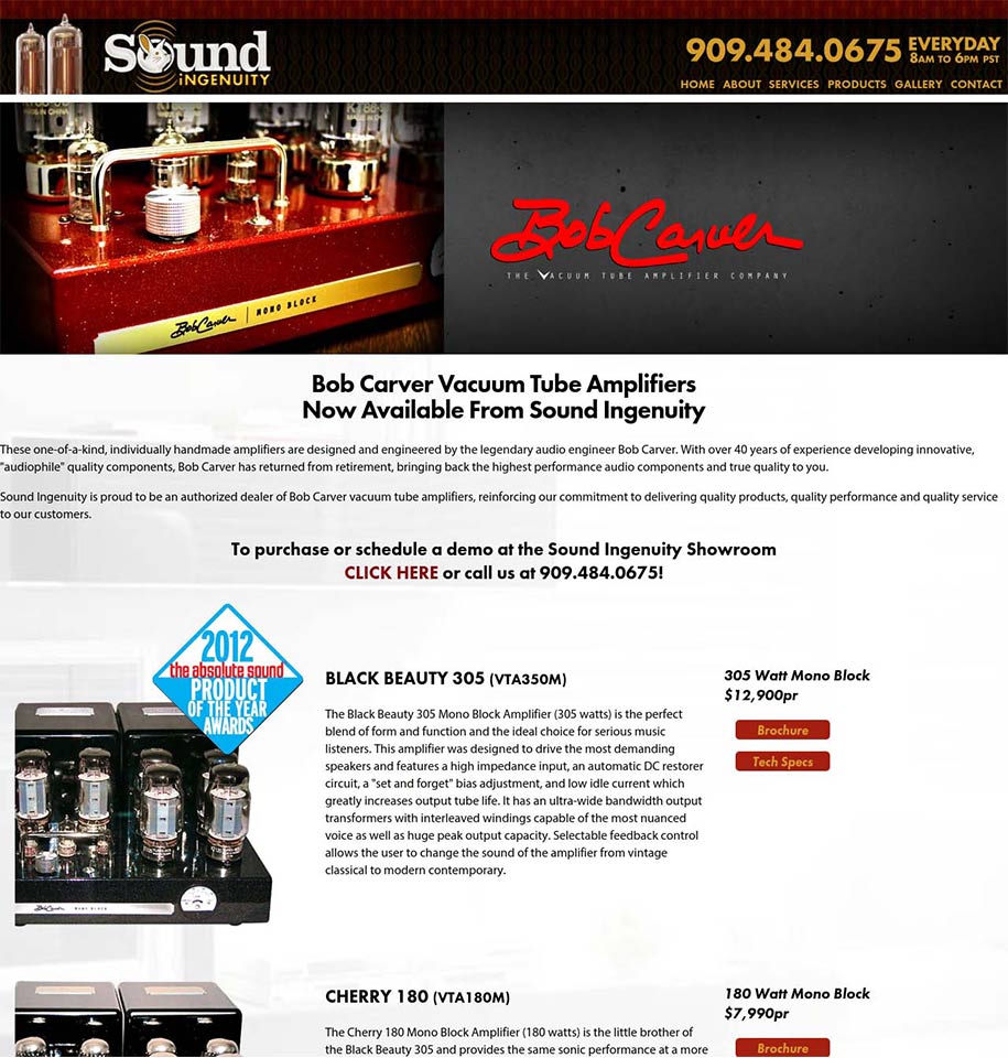
The website renovation being very much the same, simplifying the clutter to increase readability while utilizing more visually impactful layouts and assets – capturing a higher quality customer base.
Another case for the importance of readability is promoted through the layout of information and design of apparel art, leaning the most on the prominence of name recognition and easy-access contact info.


r : 35 c : 100
g : 55 m : 90
b : 114 y : 27
#233772 k : 13
r : 213 c : 17
g : 156 m : 40
b : 55 y : 96
#d59c33 k : 1
✚
the Bunny
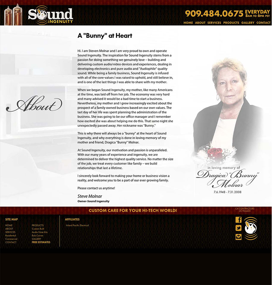
A significant feature built into the logo, the bunny has two very specific references of nostalgia – one more personal than the other. The retro aspect calls back to the days of the on-set tv antenna referred to as “rabbit ears,” while the second reference is a personal tribute to the owner’s mother, known by friends and family as “Bunny.” These references required more prominent and obvious representation.



✚ design ✚ illustrate ✚ create ✚ collaborate ✚
©SUITE76 · all rights reserved
This site is protected by reCAPTCHA and the Google Privacy Policy and Terms of Service apply.
