
✚
Helen:
A Literary
Magazine
—
roles
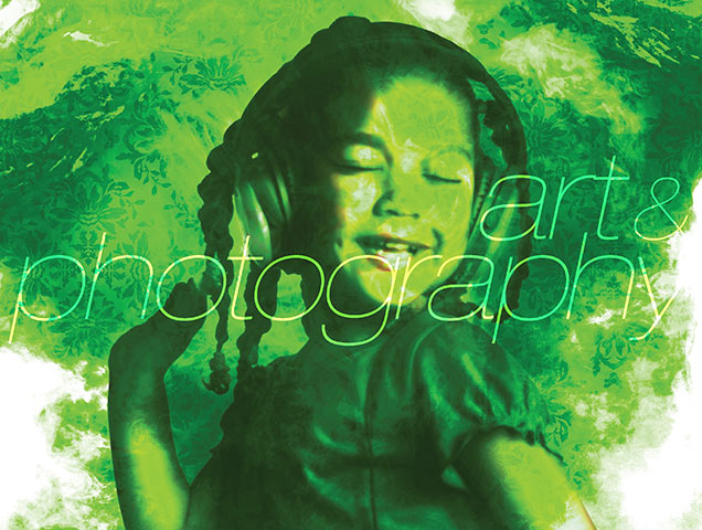
art direction – print
brand strategy
logo
editorial
illustration
—
Multi-format publication and solo-preneur endeavor Helen: A Literary Magazine is a vehicle celebrating and spotlighting local creative culture across Southern Nevada.
CHALLENGES:
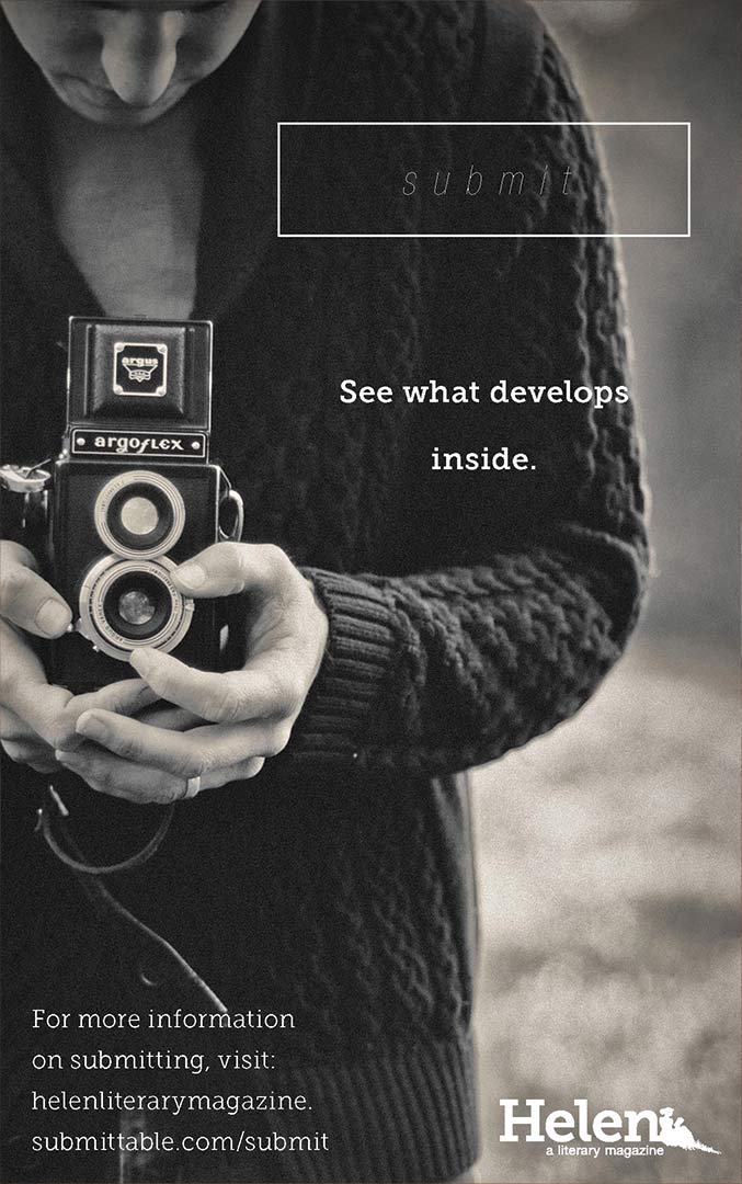
. platform | delivery – get it in their grubby lil’ paws
. layout | design – feng shui
. logo rehab – shave-and-a-hair-cut...
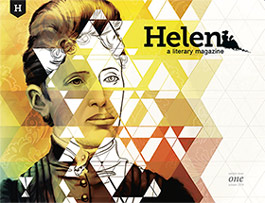
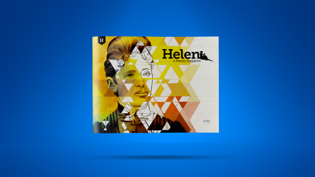
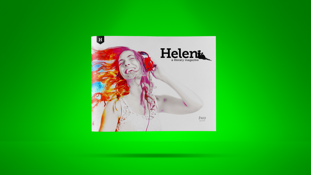
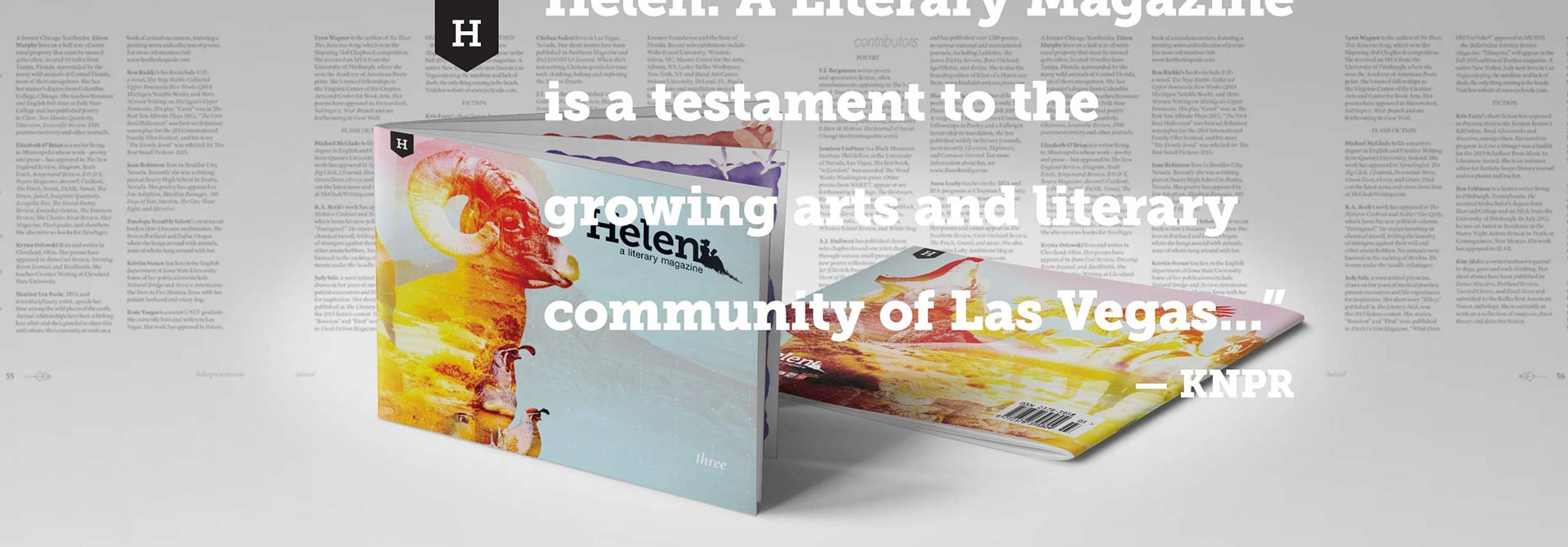
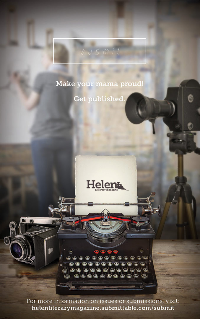
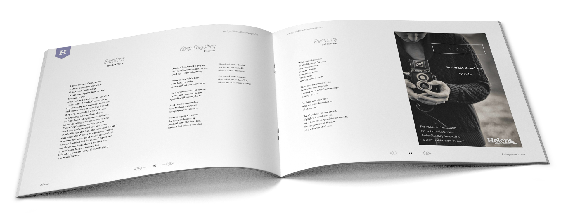
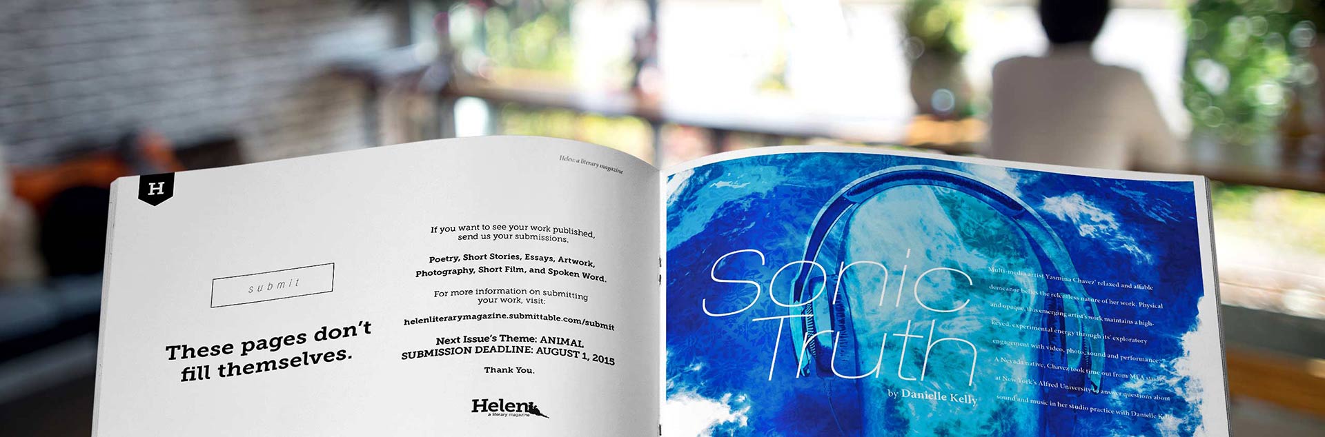
Initially imagined solely as a digital publication, a push into physical print was ultimately included in order to prevent limiting the scope of readers, with the goal of eventually being for digital platform only. The unique landscape format was adopted to force shelf positioning and immediate engagement. Though only producing three physical, bi-annual issues, the magazine did serve as a way to establish an offline snapshot of the creative community in the Mohave desert, packaged in a clean and easily navigable format – emphasizing featured talent, while maintaining lower production costs.
Along with reworking the logo to unify and simplify the elements, the vibrant and distinguished wrap around covers offer increase shelf appeal, leading to multiple “sold-out” issue restocks.
—
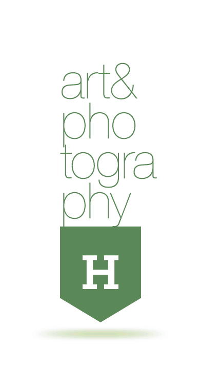
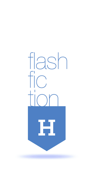
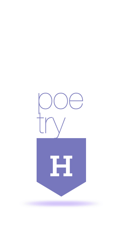
issue themes:
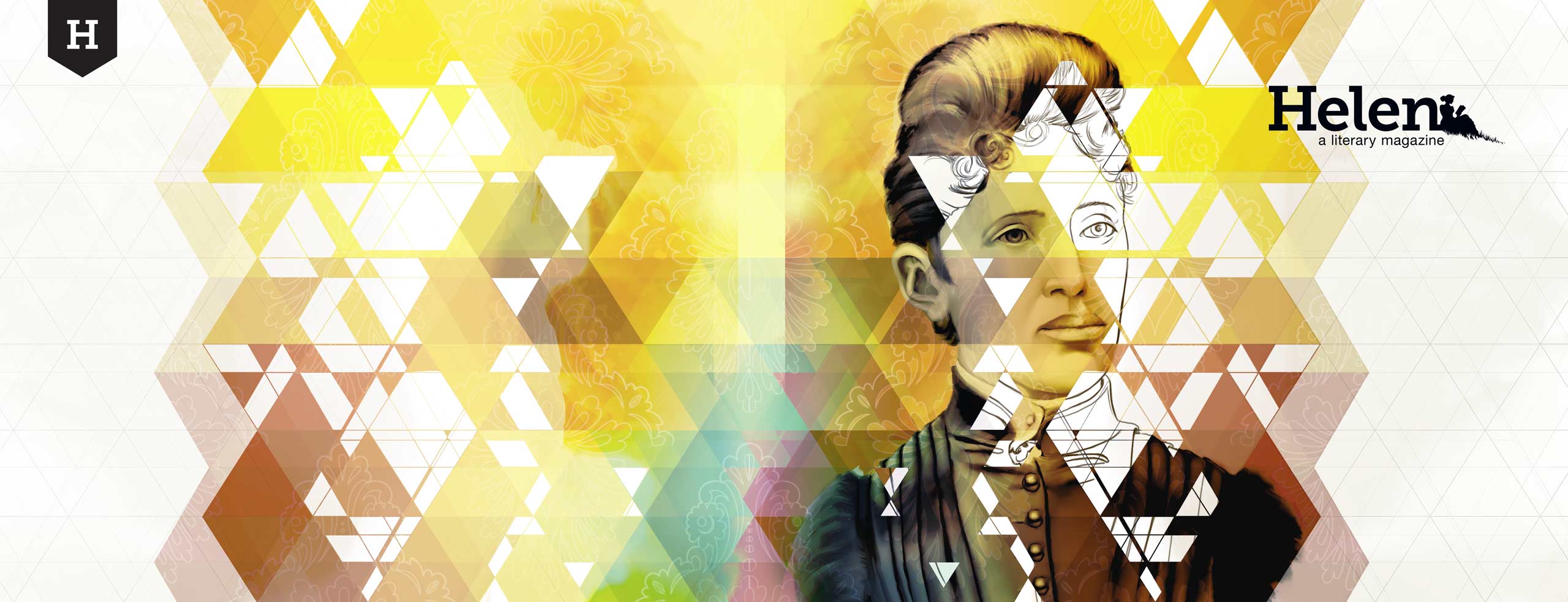
vol 01 | 01: strong female lead
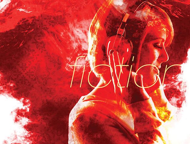
vol 01 | 02: music
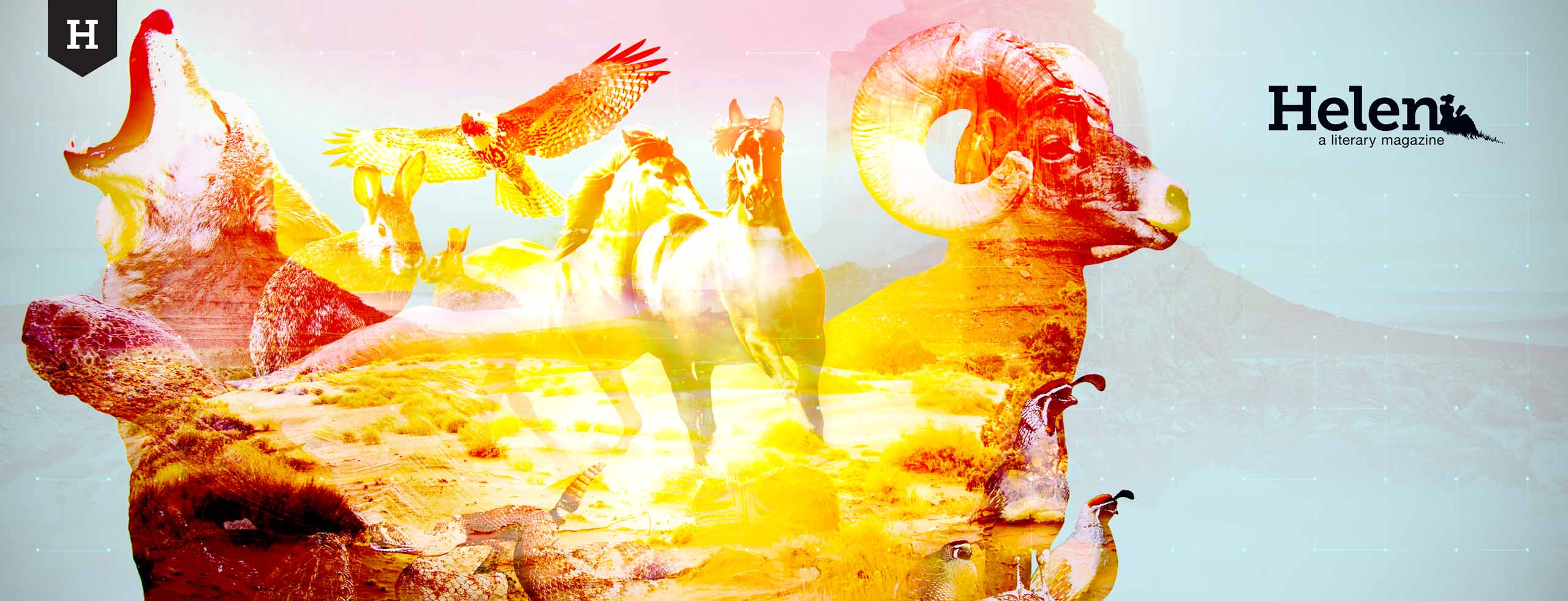
vol 02 | 03: animals
PDF preview issue:
“Our focus is on expanding the perspective of the city and greater Southern Nevadan area as well as giving a special spotlight to the local and diverse talent living here and originally from here.”
— Jocelyn Paige Kelly
Publisher & Founding Editor


—
In its limited print run, Helen: A Literary Magazine received a gracious amount of support and acknowledgment from the local arts community and participating in public events such as the annual Vegas Valley Book Festival as well as being featured in local publications such as Las Vegas Weekly, BLVDSLV, and Las Vegas Seven Magazine, and interviewed for KNPR Nevada.

✚ design ✚ illustrate ✚ create ✚ collaborate ✚
©SUITE76 · all rights reserved